
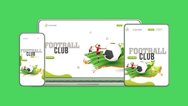
Dynamic 3D Multi Device Sports Promo

Dual Device Laptop and Mobile Screen Mockup for Cross-Platform UI Showcases

Basic Product UI Kit
GRATIS

Brand Identity System And Multi-Platform Marketing Mockup Portfolio
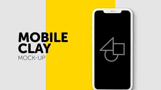
Poster Devices 29 – Opener for Mobile Desktop and Tablet Screens Motion Graphics Typography Intro for Video and Digital Media

Universal Seamless Transitions
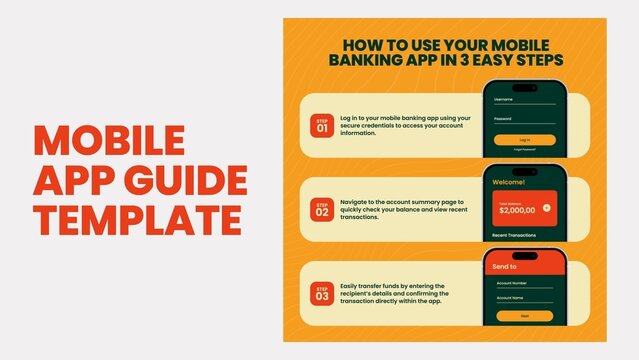
Technical Mobile App Guide Template
Hand Drawn Social Media Grid Multi-Format Title Pack with Stop Motion Waving Aesthetic
Responsive Devices Mockup 7 – Desktop Laptop Tablet Smartphone Screen Presentation, Multi Device Display Animation, Responsive Website and App UI UX Showcase Template
Responsive Devices Mockup 5 – Desktop Laptop Tablet Smartphone Screen Presentation, Multi Device Display Animation, Responsive Website and App UI UX Showcase Template
Modern Transitions
Responsive Devices 3 – Desktop Laptop Tablet Smartphone Screen Presentation, Multi Device Display Animation, Responsive Website and App UI UX Showcase Template
Responsive Devices Mockup 7 – Desktop Laptop Tablet Smartphone Screen Presentation, Multi Device Display Animation, Responsive Website and App UI UX Showcase Template
Responsive Devices Mockup 12 – Desktop Laptop Tablet Smartphone Screen Presentation, Multi Device Display Animation, Responsive Website and App UI UX Showcase Template
Responsive Devices 2 – Desktop Laptop Tablet Smartphone Screen Presentation, Multi Device Display Animation, Responsive Website and App UI UX Showcase Template
Responsive Devices 5 – Desktop Laptop Tablet Smartphone Screen Presentation, Multi Device Display Animation, Responsive Website and App UI UX Showcase Template
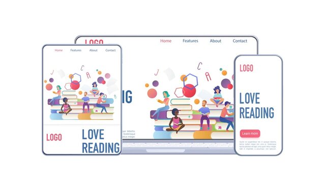
Dynamic 3D Multi Device Web Promo
Responsive Devices Mockup 3 – Desktop Laptop Tablet Smartphone Screen Presentation, Multi Device Display Animation, Responsive Website and App UI UX Showcase Template
Responsive Devices Mockup 5 – Desktop Laptop Tablet Smartphone Screen Presentation, Multi Device Display Animation, Responsive Website and App UI UX Showcase Template
Responsive Devices Mockup 9 – Desktop Laptop Tablet Smartphone Screen Presentation, Multi Device Display Animation, Responsive Website and App UI UX Showcase Template
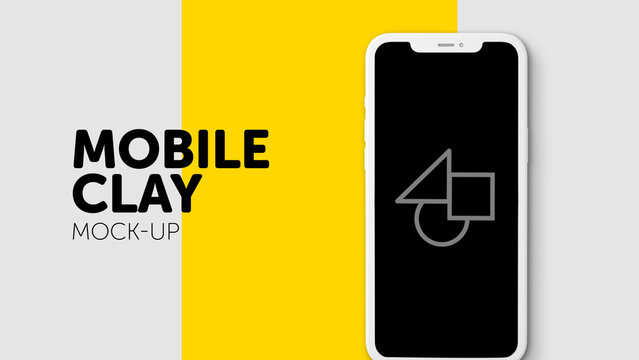
Poster Devices 29 – Opener for Mobile Desktop and Tablet Screens Motion Graphics Typography Intro for Video and Digital Media
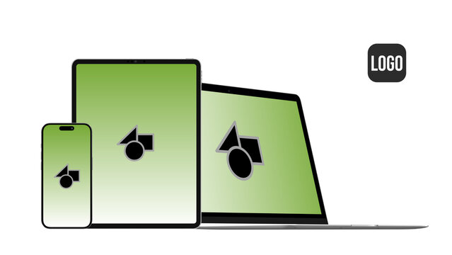
Responsive Devices Mockup 4 – Desktop Laptop Tablet Smartphone Screen Presentation, Multi Device Display Animation, Responsive Website and App UI UX Showcase Template
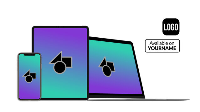
Responsive Devices 4 – Desktop Laptop Tablet Smartphone Screen Presentation, Multi Device Display Animation, Responsive Website and App UI UX Showcase Template

Kit de interfaz de usuario de producto básico
GRATIS
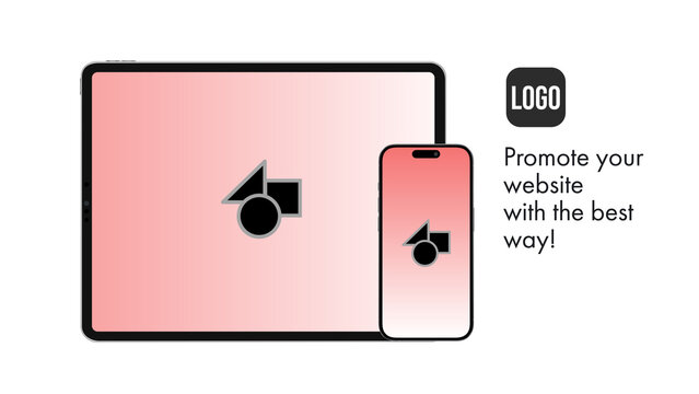
Responsive Devices Mockup 2 – Desktop Laptop Tablet Smartphone Screen Presentation, Multi Device Display Animation, Responsive Website and App UI UX Showcase Template
Responsive Devices Dark Mockup 4 – Desktop Laptop Tablet Smartphone Black Theme Presentation, Multi Screen Display for Website and App UI UX Showcase Template
Responsive Devices 3 – Desktop Laptop Tablet Smartphone Screen Presentation, Multi Device Display Animation, Responsive Website and App UI UX Showcase Template
Responsive Devices Dark Mockup 3 – Desktop Laptop Tablet Smartphone Black Theme Presentation, Multi Screen Display for Website and App UI UX Showcase Template
Responsive Devices 6 – Desktop Laptop Tablet Smartphone Screen Presentation, Multi Device Display Animation, Responsive Website and App UI UX Showcase Template
Poster Devices 18 – Opener for Mobile Desktop and Tablet Screens Motion Graphics Typography Intro for Video and Digital Media
Poster Devices 26 – Opener for Mobile Desktop and Tablet Screens Motion Graphics Typography Intro for Video and Digital Media
Responsive Devices Dark Mockup 4 – Desktop Laptop Tablet Smartphone Black Theme Presentation, Multi Screen Display for Website and App UI UX Showcase Template
Poster Devices 21 – Opener for Mobile Desktop and Tablet Screens Motion Graphics Typography Intro for Video and Digital Media
Poster Devices 17 – Opener for Mobile Desktop and Tablet Screens Motion Graphics Typography Intro for Video and Digital Media
Poster Devices 18 – Opener for Mobile Desktop and Tablet Screens Motion Graphics Typography Intro for Video and Digital Media

Responsive Devices Mockup 11 – Desktop Laptop Tablet Smartphone Screen Presentation, Multi Device Display Animation, Responsive Website and App UI UX Showcase Template
Responsive Devices 5 – Desktop Laptop Tablet Smartphone Screen Presentation, Multi Device Display Animation, Responsive Website and App UI UX Showcase Template
Responsive Devices Dark Mockup 3 – Desktop Laptop Tablet Smartphone Black Theme Presentation, Multi Screen Display for Website and App UI UX Showcase Template
Poster Devices 26 – Opener for Mobile Desktop and Tablet Screens Motion Graphics Typography Intro for Video and Digital Media
Responsive Devices Dark Mockup 3 – Desktop Laptop Tablet Smartphone Black Theme Presentation, Multi Screen Display for Website and App UI UX Showcase Template
Responsive Devices Mockup 8 – Desktop Laptop Tablet Smartphone Screen Presentation, Multi Device Display Animation, Responsive Website and App UI UX Showcase Template
Poster Devices 25 – Opener for Mobile Desktop and Tablet Screens Motion Graphics Typography Intro for Video and Digital Media
Poster Devices 21 – Opener for Mobile Desktop and Tablet Screens Motion Graphics Typography Intro for Video and Digital Media
Poster Devices 25 – Opener for Mobile Desktop and Tablet Screens Motion Graphics Typography Intro for Video and Digital Media
Responsive Devices Mockup 1 – Desktop Laptop Tablet Smartphone Screen Presentation, Multi Device Display Animation, Responsive Website and App UI UX Showcase Template
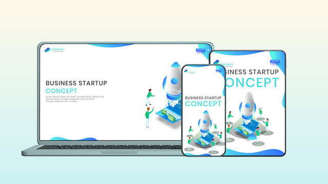
Modern Multi Device 3D Mockup Startup Promo
Responsive Devices 4 – Desktop Laptop Tablet Smartphone Screen Presentation, Multi Device Display Animation, Responsive Website and App UI UX Showcase Template

Poster Devices 20 – Opener for Mobile Desktop and Tablet Screens Motion Graphics Typography Intro for Video and Digital Media
Responsive Devices Dark Mockup 5 – Desktop Laptop Tablet Smartphone Black Theme Presentation, Multi Screen Display for Website and App UI UX Showcase Template
Responsive Devices 2 – Desktop Laptop Tablet Smartphone Screen Presentation, Multi Device Display Animation, Responsive Website and App UI UX Showcase Template
Poster Devices 27 – Opener for Mobile Desktop and Tablet Screens Motion Graphics Typography Intro for Video and Digital Media
Poster Devices 23 – Opener for Mobile Desktop and Tablet Screens Motion Graphics Typography Intro for Video and Digital Media
Responsive Devices Dark Mockup 5 – Desktop Laptop Tablet Smartphone Black Theme Presentation, Multi Screen Display for Website and App UI UX Showcase Template
Poster Devices 19 – Opener for Mobile Desktop and Tablet Screens Motion Graphics Typography Intro for Video and Digital Media
Responsive Devices Mockup 1 – Desktop Laptop Tablet Smartphone Screen Presentation, Multi Device Display Animation, Responsive Website and App UI UX Showcase Template
Responsive Devices Mockup 12 – Desktop Laptop Tablet Smartphone Screen Presentation, Multi Device Display Animation, Responsive Website and App UI UX Showcase Template
Poster Devices 30 – Opener for Mobile Desktop and Tablet Screens Motion Graphics Typography Intro for Video and Digital Media
Responsive Devices Mockup 11 – Desktop Laptop Tablet Smartphone Screen Presentation, Multi Device Display Animation, Responsive Website and App UI UX Showcase Template
Poster Devices 27 – Opener for Mobile Desktop and Tablet Screens Motion Graphics Typography Intro for Video and Digital Media
Responsive Devices 1 – Desktop Laptop Tablet Smartphone Screen Presentation, Multi Device Display Animation, Responsive Website and App UI UX Showcase Template
Responsive Devices Mockup 3 – Desktop Laptop Tablet Smartphone Screen Presentation, Multi Device Display Animation, Responsive Website and App UI UX Showcase Template

Poster Devices 28 – Opener for Mobile Desktop and Tablet Screens Motion Graphics Typography Intro for Video and Digital Media
Poster Devices 24 – Opener for Mobile Desktop and Tablet Screens Motion Graphics Typography Intro for Video and Digital Media
Poster Devices 22 – Opener for Mobile Desktop and Tablet Screens Motion Graphics Typography Intro for Video and Digital Media
Responsive Devices Dark Mockup 2 – Desktop Laptop Tablet Smartphone Black Theme Presentation, Multi Screen Display for Website and App UI UX Showcase Template
Responsive Devices Mockup 2 – Desktop Laptop Tablet Smartphone Screen Presentation, Multi Device Display Animation, Responsive Website and App UI UX Showcase Template
Responsive Devices Mockup 8 – Desktop Laptop Tablet Smartphone Screen Presentation, Multi Device Display Animation, Responsive Website and App UI UX Showcase Template

Poster Devices 28 – Opener for Mobile Desktop and Tablet Screens Motion Graphics Typography Intro for Video and Digital Media
Poster Devices 19 – Opener for Mobile Desktop and Tablet Screens Motion Graphics Typography Intro for Video and Digital Media
Responsive Devices Dark Mockup 3 – Desktop Laptop Tablet Smartphone Black Theme Presentation, Multi Screen Display for Website and App UI UX Showcase Template
Responsive Devices Dark Mockup 1 – Desktop Laptop Tablet Smartphone Black Theme Presentation, Multi Screen Display for Website and App UI UX Showcase Template
Poster Devices 23 – Opener for Mobile Desktop and Tablet Screens Motion Graphics Typography Intro for Video and Digital Media

Poster Devices 20 – Opener for Mobile Desktop and Tablet Screens Motion Graphics Typography Intro for Video and Digital Media
Responsive Devices 6 – Desktop Laptop Tablet Smartphone Screen Presentation, Multi Device Display Animation, Responsive Website and App UI UX Showcase Template
Poster Devices 30 – Opener for Mobile Desktop and Tablet Screens Motion Graphics Typography Intro for Video and Digital Media

Anime Speed Lines Multi-Format Title Pack with 16:9, 9:16 and 1:1 Ratios
Poster Devices 22 – Opener for Mobile Desktop and Tablet Screens Motion Graphics Typography Intro for Video and Digital Media

Multi‑Device Mockup Featuring Laptop, Tablet, and Smartphone for Cross‑Platform UI Presentations
Responsive Devices Mockup 6 – Desktop Laptop Tablet Smartphone Screen Presentation, Multi Device Display Animation, Responsive Website and App UI UX Showcase Template
Responsive Devices Mockup 10 – Desktop Laptop Tablet Smartphone Screen Presentation, Multi Device Display Animation, Responsive Website and App UI UX Showcase Template
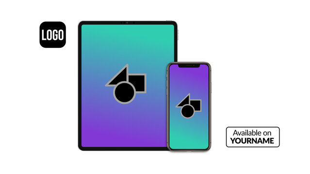
Responsive Devices 1 – Desktop Laptop Tablet Smartphone Screen Presentation, Multi Device Display Animation, Responsive Website and App UI UX Showcase Template

Responsive Devices Dark Mockup 1 – Desktop Laptop Tablet Smartphone Black Theme Presentation, Multi Screen Display for Website and App UI UX Showcase Template
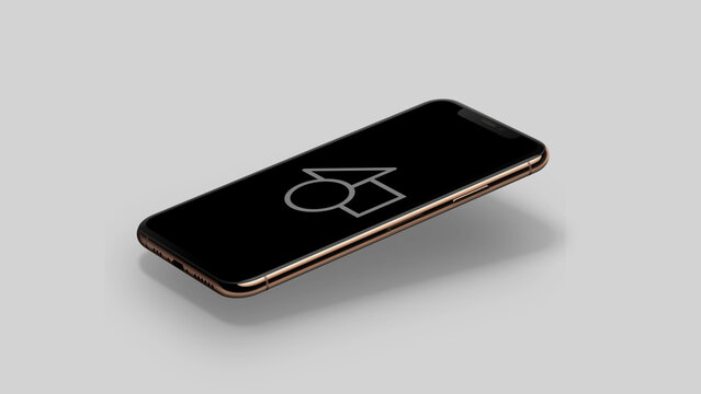
Poster Devices 17 – Opener for Mobile Desktop and Tablet Screens Motion Graphics Typography Intro for Video and Digital Media
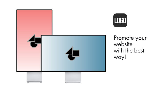
Responsive Devices Mockup 10 – Desktop Laptop Tablet Smartphone Screen Presentation, Multi Device Display Animation, Responsive Website and App UI UX Showcase Template
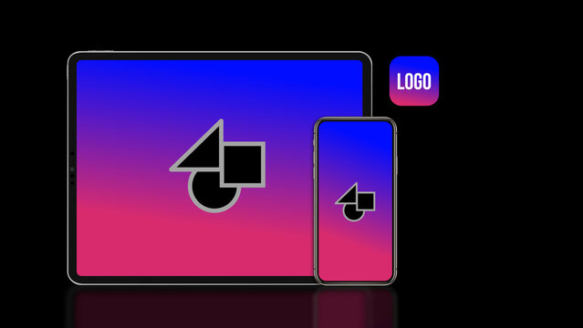
Responsive Devices Dark Mockup 2 – Desktop Laptop Tablet Smartphone Black Theme Presentation, Multi Screen Display for Website and App UI UX Showcase Template
Responsive Devices Mockup 9 – Desktop Laptop Tablet Smartphone Screen Presentation, Multi Device Display Animation, Responsive Website and App UI UX Showcase Template
Responsive Devices Mockup 4 – Desktop Laptop Tablet Smartphone Screen Presentation, Multi Device Display Animation, Responsive Website and App UI UX Showcase Template
Responsive Devices Mockup 6 – Desktop Laptop Tablet Smartphone Screen Presentation, Multi Device Display Animation, Responsive Website and App UI UX Showcase Template
Einfaches UI-Kit für Produkte
GRATIS
ベーシックプロダクトUI キット
GRATIS
Poster Devices 31 – Opener for Mobile Desktop and Tablet Screens Motion Graphics Typography Intro for Video and Digital Media
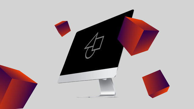
Poster Devices 24 – Opener for Mobile Desktop and Tablet Screens Motion Graphics Typography Intro for Video and Digital Media
Kit per interfaccia utente prodotto di base
GRATIS