
Why Nature Colors Inspire Calm and Creativity
Ever wonder why a walk through a park instantly clears your mind? Or why staring at ocean waves feels therapeutic? The answer lies in color psychology specifically, the powerful effects of green and blue on our brains.
These nature-inspired hues aren't just visually appealing; they're scientifically proven to calm our nervous systems, boost creativity, and enhance our overall well-being. Whether you're a designer choosing a brand palette, a creative professional selecting imagery for your next project, or simply someone looking to create more inspiring spaces, understanding these colors can transform how you work and feel. And this is how the Adobe Stock Nature inspiration collection can help.
Key takeaways:
- Green reduces stress and anxiety: Exposure to green environments lowers cortisol levels and decreases heart rates, creating immediate calming effects that help your nervous system relax.
- Blue enhances creativity and focus: Research shows that blue backgrounds boost creative thinking by up to 20% and improve problem solving abilities, making it ideal for brainstorming and innovation.
- Nature colors improve productivity: People are more productive in spaces with green and blue elements, experiencing better concentration and reduced eye strain during extended work sessions.
- Design applications are endless: Incorporating these colors strategically from branding to social media content can elevate your creative work and help ensure that it connects more deeply with your audience's emotional responses.
- Adobe Stock offers extensive resources: With 900+ million assets including nature-inspired images, videos, and design templates, Adobe Stock makes it easy to find the perfect green and blue visuals to bring calming, creative energy to any project.
The science behind green's calming power
Here's something fascinating: Your eyes are built to favor green. The human eye can distinguish more shades of green than any other color — a trait developed over millions of years of evolution. Green sits in the middle of the visible light spectrum, which means your eyes process it with minimal strain. This isn't just trivia; it explains why looking at greenery feels effortless and naturally soothing.
Green environments reduce stress hormones and lower blood pressure. When you're surrounded by green, whether it's a forest view or a simple desktop wallpaper, your parasympathetic nervous system activates, triggering what researchers call the "relaxation response." Studies published in PMC journals show that even brief exposure to green spaces can decrease the heart rate by 5–10 beats per minute and reduce feelings of anxiety within minutes.
But green's benefits extend beyond immediate calm. The color has been shown to improve reading comprehension and concentration when used in work environments. A study published in the Journal of Environmental Psychology found that participants performed better on detail-oriented tasks when working in rooms with green elements. The theory? Green provides just enough visual interest to keep your brain engaged without overwhelming it, which is the sweet spot for sustained focus.
Nature in Design
Add organic elements to your digital projects

Seasonal Nature Photography
Tips for capturing nature across all seasons
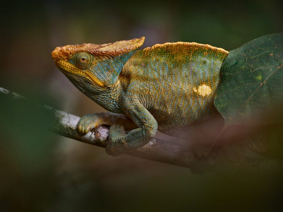
Wildlife Photography Guide
Master settings and storytelling for wildlife shots


Why different shades of green create different moods
Not all greens are created equal. The psychological impact shifts dramatically depending on whether you're looking at mint, forest green, or sage. Light greens with yellow undertones feel fresh and energizing, think spring growth and new beginnings. These brighter shades work beautifully for projects that need to communicate vitality and optimism.
Darker greens tell a different story. Deep forest greens and olive tones convey stability, tradition, and sophistication. These colors make people feel grounded and secure, which is why financial institutions and luxury brands often incorporate them into their visual identities. Darker greens with blue undertones feel more calming, while those leaning toward yellow seem warmer and more nurturing.
For creative professionals working with Adobe Stock, understanding these distinctions can transform how you select imagery. A bright lime green might energize a tech startup's social media campaign, while a muted sage could bring sophistication to a wellness brand's website. In the Adobe Stock Nature inspiration collection, you can find extensive stock images to help you find the exact shade and element that matches your project's emotional intent.
Blue's dual superpower: calm and creativity
Blue pulls off something remarkable: It simultaneously calms and stimulates your mind. Sound contradictory? It's actually one of the most useful traits in color psychology. Research from the University of British Columbia found that blue backgrounds improved participants' creative thinking by encouraging an "approach motivation" — the psychological state where you feel open to exploration and new ideas.
The study revealed that people working against blue backgrounds generated 20% more creative solutions and showed enhanced performance on brainstorming tasks. Why? Blue triggers associative thinking in which your brain makes unexpected connections and explores possibilities rather than narrowing focus. This makes the color blue invaluable for creative professionals tackling complex design challenges or developing innovative campaign concepts.
At the same time, blue maintains its reputation as the most calming color. Light blues lower blood pressure and slow breathing, creating the mental space needed for deep work. Blue environments have been observed to reduce stress hormones by 12–15%. When you're designing a workspace or selecting visuals for a presentation, incorporating blue elements will help your audience feel simultaneously relaxed and mentally engaged. It’s the perfect color for holding attention without causing overwhelm.
Blue's proven benefits for creative work:
- Increased creative output: Blue-dominant environments have been shown to improve the generation of novel ideas and solutions by up to 20%.
- Enhanced problem-solving: Blue activates the brain's associative networks, making it easier to see connections between seemingly unrelated concepts.
- Sustained concentration: Unlike stimulating colors that cause fatigue, blue helps people maintain focus over extended periods without mental exhaustion.
- Trust building: Blue content generates higher engagement on social platforms because viewers unconsciously perceive it as more trustworthy and reliable.
How shade variations change blue's psychological impact
Sky blues and navy blues live in different psychological worlds. Light, airy blues remind us of clear skies and open horizons — they feel expansive, free, and optimistic. These shades work exceptionally well for brands emphasizing transparency and approachability. Tech companies love light blue because it signals innovation without intimidation.
Deeper blues represent authority and trustworthiness. Navy and royal blue have long been associated with professionalism and competence. This is why these colors dominate corporate branding. These darker shades inspire confidence and suggest stability, making them ideal for financial services, healthcare, and professional service brands.
Teal and turquoise bridge the gap between blue and green, combining blue's creative stimulation with green's calming properties. These hybrid shades feel both sophisticated and natural, making them increasingly popular in modern design. When you're browsing Adobe Stock video clips of teal-toned ocean footage or Motion Graphics templates with blue-green gradient backgrounds, remember that you can elevate your content by using content that has this balanced emotional appeal.
Practical applications for creative professionals
Understanding color psychology and applying it strategically can help you turn theory into a powerful tool. For social media content, blue posts typically generate higher engagement because they feel less aggressive than warmer colors. People scroll past them more slowly, giving your message extra visibility. Green performs exceptionally well for wellness, sustainability, and lifestyle content, immediately connecting with audiences seeking balance and authenticity.
In branding and marketing design, consider your color choices carefully based on desired perception. Green signals environmental consciousness and health, making it ideal for wellness and sustainability -focused brands. Blue dominates tech and finance because it communicates reliability and innovation simultaneously. Brands that use blue are frequently perceived as more trustworthy and competent, which explains why the color is often used in branding for professional services companies.
For video professionals and content creators, incorporating nature colors creates immediate emotional resonance. Viewers respond more positively to content featuring natural color palettes. Their attention spans increase and they report feeling more relaxed while watching. Whether you're editing a corporate video or creating social content, using Adobe Stock nature footage or applying blue-green color grades can dramatically improve viewer response.
FAQ
Green sits in the middle of the visible light spectrum, making it the easiest color for the human eye to process. This requires minimal strain on eye muscles, naturally inducing relaxation. Additionally, green's association with nature triggers evolutionary responses in our nervous system, lowering stress hormones and heart rates.

Incredible royalty-free stock photos and more
Whether you need a stunning stock photo, vector image, HD video clip, or Adobe Photoshop template, Adobe Stock has the perfect option.